Accessibility Testing: Color Blindness
Accessibility Testing: Color Blindness
Accessibility testing is one of the types of usability testing. Its purpose is to ensure that our product is user friendly and easy to use, including for people with various disabilities and peculiarities of perception. These can be problems with visual perception, hearing, or limited hand mobility. Unfortunately, these categories of people are often neglected.
Accessibility testing is one of the types of usability testing. Its purpose is to ensure that our product is user friendly and easy to use, including for people with various disabilities and peculiarities of perception. These can be problems with visual perception, hearing, or limited hand mobility. Unfortunately, these categories of people are often neglected.
Consider, for example, people with color blindness (daltonism). This is a rather common deficiency. Color blindness of various kinds affects approximate 8% of men and 0.4% of women. That's quite a number!
It's not a disability, of course, but such a peculiar color vision can make the perception of information difficult, and some activities, such as driving a car, can be more challenging.
Most often, color blindness is genetic, but there can be other causes as well, such as age-related changes, traumas or side effects of some medications.
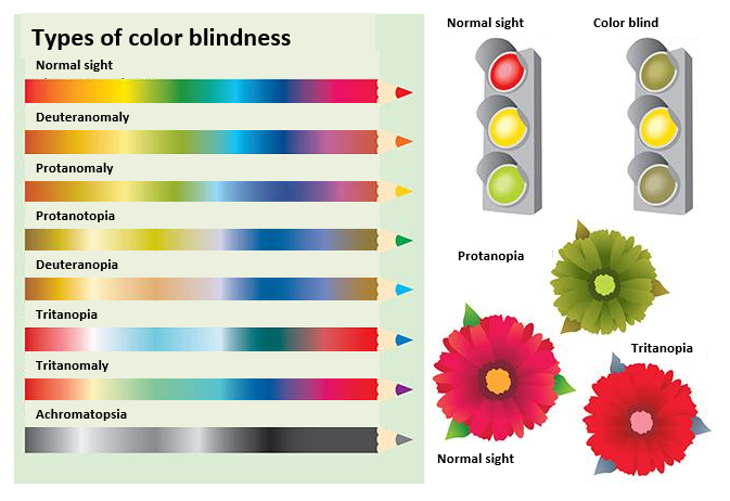
There are several types of color blindness.
Achromatopsia is a complete lack of the perception of color; occurring very rarely – in approximately 1 person in 10,000!
The most common type is deuteranomaly, which occurs in ~5-6% of men and in ~0.3-0.4% of women. It is a reduced sensitivity to green light. Other color deficiencies such as sensitivity to red and green light — protanomaly, protanopia, and deuteranopia — occur approximately in 1 per 100 men and in 1 per 1000 women.
Distorsions also occur in the perception of blue-violet colors — tritanomalia and tritanopia, which affect less than 1% of males and females. In this case, the occurrence does not depend on gender, since this type of color blindness is caused by mutations in chromosome 7.
It looks very sophisticated and complicated, doesn't it? What can you do to make your product user-friendly and comprehensible for people with color vision deficiencies?
Actually, what you need is to adhere to two simple principles:
1. Color should not be the only way of information transmission.
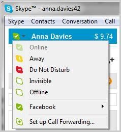
If you use color to display, say, a status, you should duplicate that information in some other way as well — shapes, icons, or text comments. Here is an example of statuses in Skype:
2. High Contrast.
A higher contrast contributes to better visibility of controls and text even for people who are unable to discern certain color combinations.
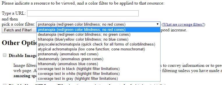
There is an excellent tool for testing web sites to check the accessibility for people with various types of color blindness: Color Blind Web Page Filter
You need just to type a URL and select a color filter:
Attention! If you follow the link to another page, it will open in normal view. So if you want to test several pages, type the URL of each one in turn.
This simple and quick test will help you easily identify problems with web page accessibility.
If you want to reduce the number of tests, you can use only three filters: deuteranopia, protanopia, and tritanopia. These are the most expressed forms of color blindness (except very rare monochromatic vision). People with other forms of color perception deficiency can see more hues, and if your UI controls are sufficiently visible with these three filters, then they will display correctly for others as well.
Victoria Slinyavchuk
Consultant on Software Testing
Consider, for example, people with color blindness (daltonism). This is a rather common deficiency. Color blindness of various kinds affects approximate 8% of men and 0.4% of women. That's quite a number!
It's not a disability, of course, but such a peculiar color vision can make the perception of information difficult, and some activities, such as driving a car, can be more challenging.
Most often, color blindness is genetic, but there can be other causes as well, such as age-related changes, traumas or side effects of some medications.

There are several types of color blindness.
Achromatopsia is a complete lack of the perception of color; occurring very rarely – in approximately 1 person in 10,000!
The most common type is deuteranomaly, which occurs in ~5-6% of men and in ~0.3-0.4% of women. It is a reduced sensitivity to green light. Other color deficiencies such as sensitivity to red and green light — protanomaly, protanopia, and deuteranopia — occur approximately in 1 per 100 men and in 1 per 1000 women.
Distorsions also occur in the perception of blue-violet colors — tritanomalia and tritanopia, which affect less than 1% of males and females. In this case, the occurrence does not depend on gender, since this type of color blindness is caused by mutations in chromosome 7.
It looks very sophisticated and complicated, doesn't it? What can you do to make your product user-friendly and comprehensible for people with color vision deficiencies?
Actually, what you need is to adhere to two simple principles:
1. Color should not be the only way of information transmission.
If you use color to display, say, a status, you should duplicate that information in some other way as well — shapes, icons, or text comments. Here is an example of statuses in Skype:

2. High Contrast.
A higher contrast contributes to better visibility of controls and text even for people who are unable to discern certain color combinations.
There is an excellent tool for testing web sites to check the accessibility for people with various types of color blindness: Color Blind Web Page Filter
You need just to type a URL and select a color filter:

Attention! If you follow the link to another page, it will open in normal view. So if you want to test several pages, type the URL of each one in turn.
This simple and quick test will help you easily identify problems with web page accessibility.
If you want to reduce the number of tests, you can use only three filters: deuteranopia, protanopia, and tritanopia. These are the most expressed forms of color blindness (except very rare monochromatic vision). People with other forms of color perception deficiency can see more hues, and if your UI controls are sufficiently visible with these three filters, then they will display correctly for others as well.
Victoria Slinyavchuk
Consultant on Software Testing
